Microsoft OfficeTelling the story of achievement and aspiration
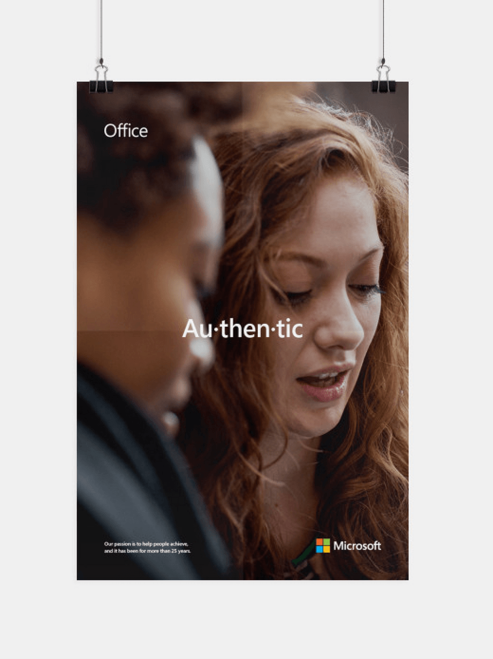
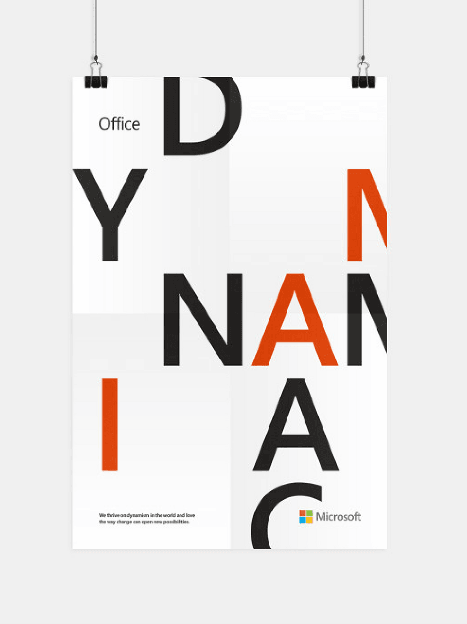
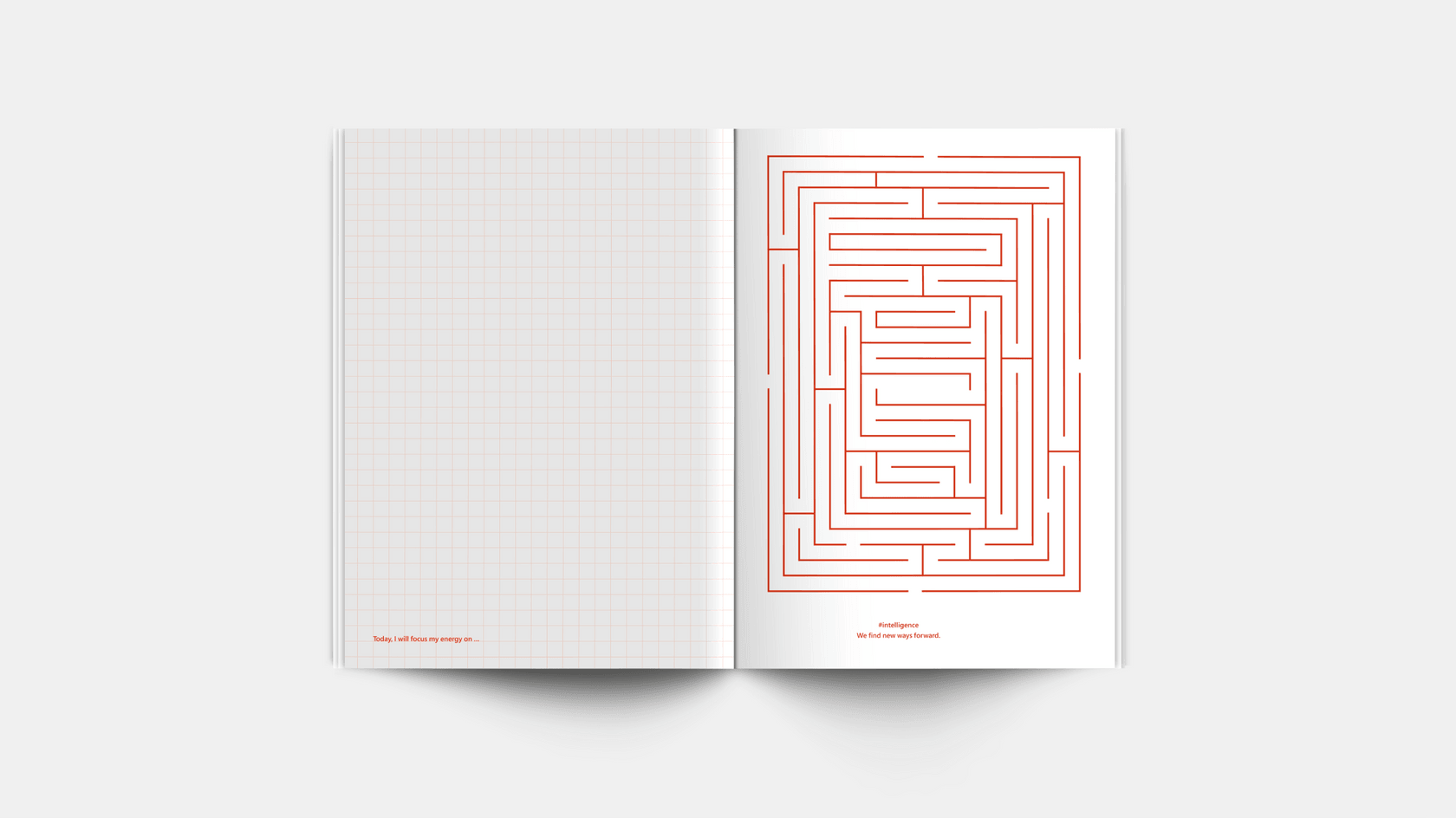
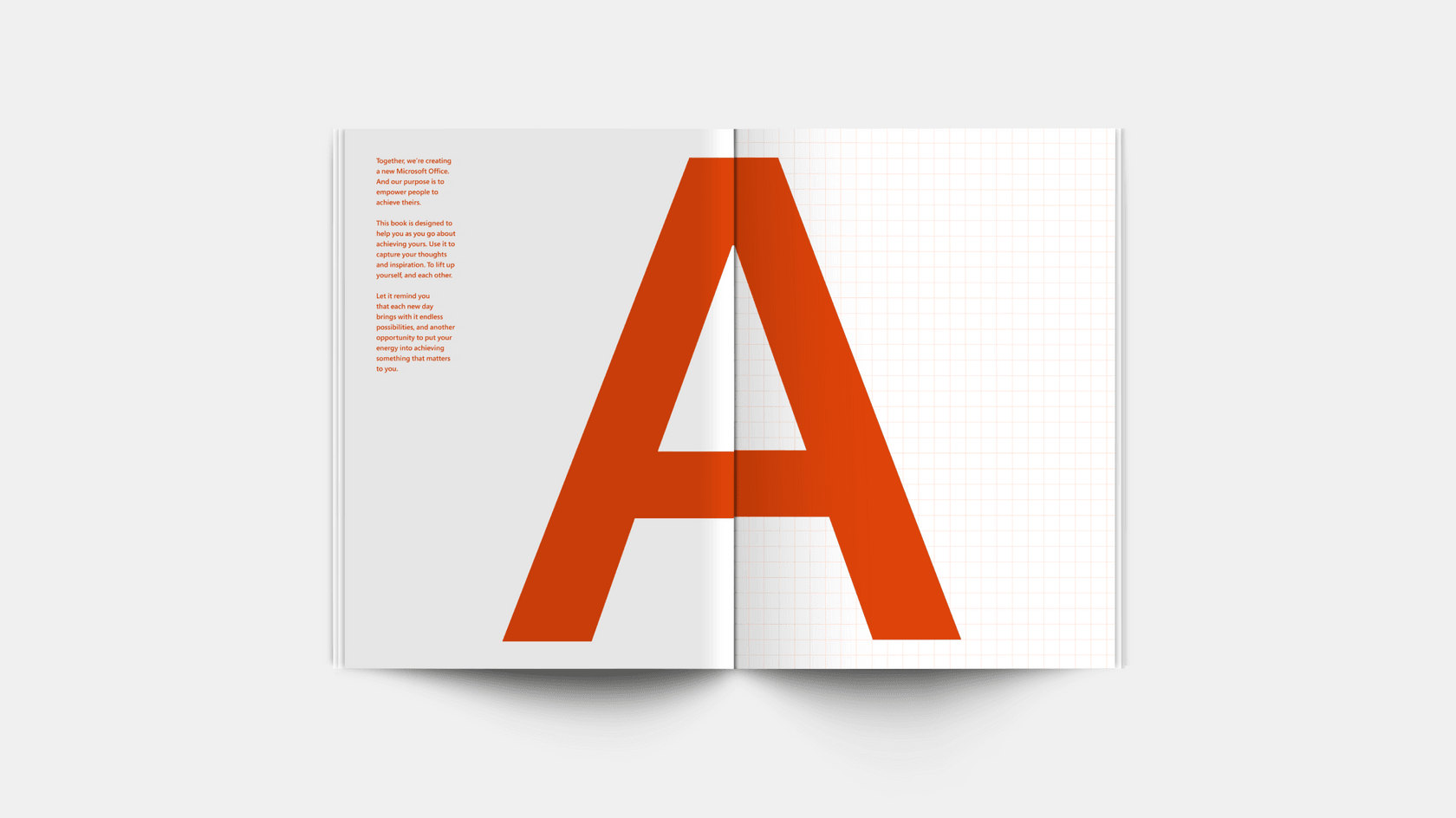
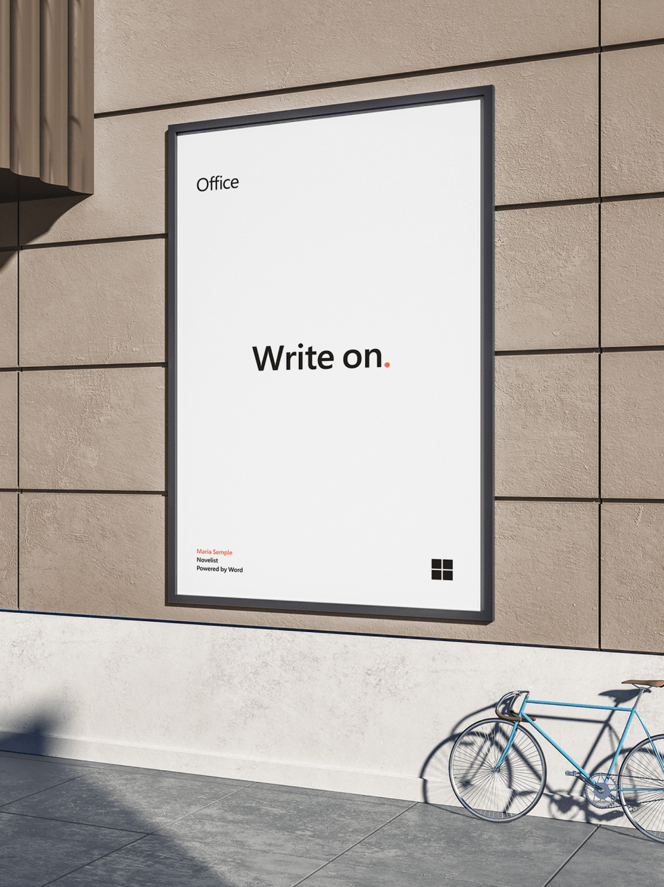
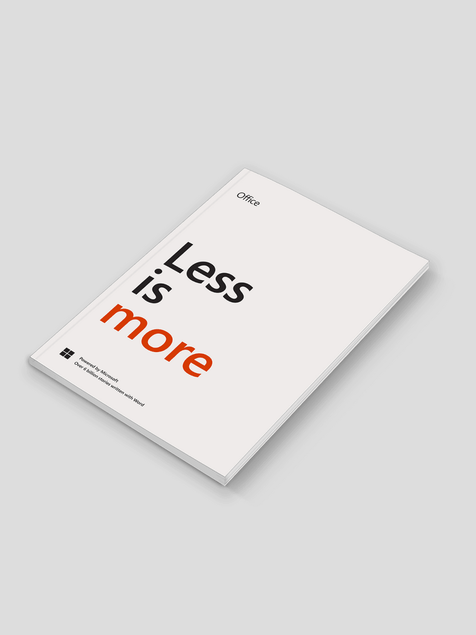
We collaborated on a rebrand that communicates how Microsoft Office helps people and businesses achieve what matters to them.
What matters most
The new brand emphasizes purpose over process, while staying true to the roots of Microsoft Office as the most efficient way to get things done.
One brand, many expressions
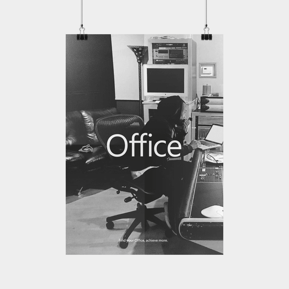
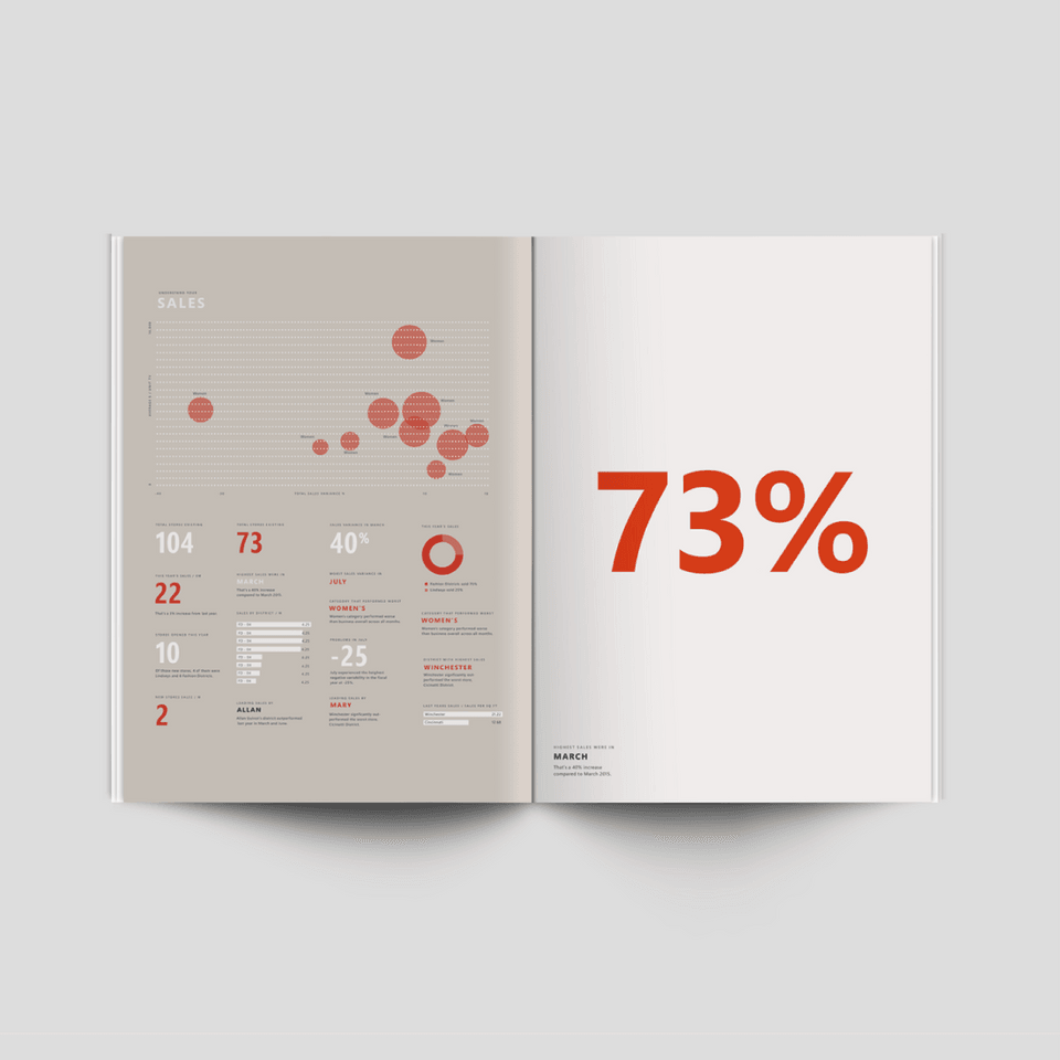
A flexible design system allows the brand’s core elements to be tuned to different audiences in ways uniquely relevant to them.

Alignment and evolution
Clear, robust guidelines ensure consistency however the brand is used, while maintaining enough flexibility to scale over time.
Expertise
Brand strategy / Brand expression / Brand architecture / Graphic design / Motion / Digital design / Guidelines / Responsive web development
